Keim paints

I recently completed a large project for a private home in London in which I applied Keim paints to the walls. I have been meaning to introduce these paints into my interiors for a while, and now that it’s been done there’s no turning back!

Keim mineral paints are natural, non-toxic, non-flammable and completely odourless. They are made from natural minerals, water glass (potassium silicate), and earth oxide pigments. Unlike conventional acrylic paints, they do not contain any VOCs (Volatile Organic Compounds), solvents or petrochemicals. This means they do not release any fumes into the atmosphere, making them perfect for people with allergies, children, and of course the environment.

I was requested to come up with a colour scheme for this north-facing period Victorian room; my client complained that it lacked character, and felt dark and gloomy. They asked me to make the room lighter and more welcoming, with a sense of warmth— without using creams, yellows, and oranges as these have already been used throughout their property.

One of the main features of the room is the beautiful original marble fireplace, so this was my point de départ. By picking out the colours of the marble veins— grey and a warm cream— I was able to bring the room together as a whole.

Additionally, the picture rail had previously stuck out like a sore thumb, visually it was the focus of the room and created an aggressive division.

I solved this by painting the ceilng down to the picture rail, including the ornate cornice, a slight off-white. I personally never use pure white on the ceiling, I always break it with a drop of colourant to make it less harsh. This immediately makes the room larger and brighter. The picture rail together with all the woodwork was painted in oil-based satin, pure white. In doing so, the division is much more subtle and pleasing to the eye.

The contrast between the grey and cream gives the room a dynamic, contemporary feel, whilst retaining the period character. These two colours also happen to be best suited to the direction of the room by the principles of Feng Shui.

The finished room is a peaceful, elegant, and inviting place and I hope my clients enjoy it for many years to come.

Spirit Fox & Heart

I would like to thank everyone for the unexpected positive feedback I received after posting Vespertilio, my pleated paper bat.

The art of paper folding- origami- is often associated with a square piece of paper that is folded without adding any cuts. This is only a recent development; the traditional Japanese art form included various shapes of paper which often contained incisions.

In my own paper models, I am removing the boundaries of working within a square, widening the limits of different shapes and sizes. I am also trying to keep the finished model as simple as possible without adding superfluous creases. This is often more challenging than one may expect.

These two paper models are made from the same square sheet of paper. Similar to Vespertilio, they involve simple radial pleats, a theme I am continually exploring. Both creations can be made from any type of paper. For the fox, it helps if the paper is slightly transparent when backlit or put close to a window so that the facial expression is visible.

I believe that if something is simple enough, it does not require words- therefore my diagrams contain only images. The following PDF document below contains a set of photo instructions of how to fold my two models if you would like to give them a try.

Fox_and_Heart-Ioana_Stoian-2012 (PDF)


Art Deco Sampler

My inspiration for projects rarely comes directly from other artworks I have seen and wish to reproduce. The piece I have just completed however, is an exception. I came across this Art Deco sampler the other day whilst doing some research and for days I could not get it out of my head.

Samplers such as this one were originally published in journals for decorative painters. Various elements of the sampler would have been copied or modified and used in future projects.

Reproducing these patterns was a lengthy process necessitating patience and skill. Today, with the help of modern technologies, it is very easy to take an image and reproduce it without such hardship. However I feel that we have forgotten just how much skill and time was previously required to obtain a simple decoration; therefore I decided to give myself the technical challenge of reproducing this sampler by hand. I used oil paints on canvas- my first time using canvas in my own work. The canvas was pinned down to a wooden board so that I could apply pressure whilst painting, although it is more common to stretch the canvas on a wooden or metallic frame.

The canvas was prepared by applying around eight coats of acrylic gesso, then sanding the canvas down to create a smooth surface. The more coats of gesso, the smoother the surface; although oil paint has wonderful qualities of evening out by itself if applied correctly. Acrylic gesso is not technically gesso at all, and artists tend to have different opinions as to which one is best. The sole reason it was used here was convenience. Acrylic gesso is cheap, easy to find and easy to apply. However the next time I work on canvas I will make my own gesso using rabbit-skin glue, chalk and pigment.

The pattern was transferred on to the canvas using the pouncing method, once I had applied a background colour of white, raw sienna and raw umber. I used oil paints diluted with a glaze of linseed oil, turpentine and a bit of siccative (drying liquid). This is the traditional painting method, and one I have adopted for most of my work.

As this sampler is rather complicated, the work was split in to four stages:

  1. Block in large shapes in roughly the right colour. I always apply two coats (or more) of paint to achieve a very solid finish; as the second coat can always be adjusted I do not worry about finding the exact colour straight away.
  2. Spend the time to mix up final colours and apply with precision. This stage will make the paint opaque and uniform. I also rectify any contours if necessary.
  3. Concentrate on details; dots, white lines, most elements which require one brush stroke.
  4. Clean up if needed. I always keep some extra paint for ‘touch-ups’.

I have made a beautiful deep blue made up of ultramarine blue, cobalt blue and burnt umber. The final coat of red is a mix of mars red and van dyke brown. The light cream is made up from white, raw umber, Cassel earth and mars red.

These are not the exact same colours that are on the original image of this sampler; I have a personal preference towards richer colours with more depth, and feel that in this case the overall harmony of the work has not been challenged. You will also notice that I have modified a few of the motifs to suit my personal aesthetics. As a trained decorative painter, I am very capable of matching specific colours when required. In this case, it was not imperative and I followed my intuition concerning colours and form.

I’m very pleased with the final result!

Pleated Paper Bat

Vespertilio
Vespertilio
Vespertilio

As well as being a decorative painter, I am also involved in the international paper-folding community.

At a recent gathering in Freising, Germany, I came up with this stylised design for a bat – “Vespertilio“.

I am fascinated by the Art Nouveau and Art Deco periods; the use of geometry and patterns to create intricate friezes and designs amazes me. My fondness of Art Deco decoration has inspired me to create this paper bat which simply uses a 2 x 1 rectangle, radial pleats and three cuts.

This design can be folded from any paper, but I would recommend using a thicker paper to facilitate creasing. In this case I have used 110gsm Elephant Hide, known for its structural qualities.

With help from my very supportive partner Eric Gjerde, I have put together a PDF document that includes a diagram and photos of how to fold this bat if you wish to fold your own. You can download it via the following link.

UPDATE: This model, with full diagrams, is featured in my new book, “Origami for All: Elegant Designs from Simple Folds“.

Vespertilio – Origami Diagrams by Ioana Stoian (PDF)

Cherry blossom stencil

Inspired by Japanese silk screens and minimalist design I created this artwork for A l’Etoile, a restaurant in Klingenthal, Alsace.

My stencil was based on cherry blossom branches that I picked off a neighbour’s tree. These branches were photographed and then rendered into vector images using Illustrator. The stencils were hand cut from thick tracing paper coated with varnish.

All three wooden panels were executed in oil paints. I applied a thin irridescent oil glaze to the background with the intention that this would catch light from the nearby windows.

I was assisted by Nadege Delbeq, a local artist, for the stenciling.

Tadelakt wash basin and stand

I often work in collaboration with Peinture Fischer, a French company specialising in 100% natural decorative products of their own fabrication in Rosheim, a medieval town in Alsace.

Our latest project together involved creating a wash basin, stand and soap dish with a tadelakt finish. Tadelakt is a lime plaster originating in Morocco and traditionally produced with lime from Marrakech. It has been used for thousands of years on interior and exterior walls due to its natural water resistance and beautifully polished finish. Tadelakt is an extremely time consuming and laborious product to work with. As with most natural materials it reacts differently depending on the surface, humidity level, and ambient temperature. Professionals take years to master the art of applying such materials and to learn how to ‘listen’ to them.  This was my first hands-on experience with tadelakt, so it is therefore challenging for me to describe the whole process in great depth. I have attempted to share my experience as best I can.

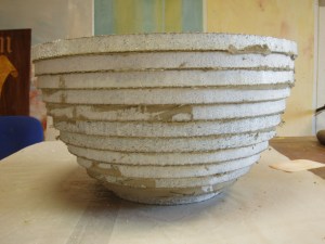
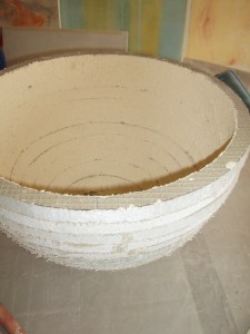
The first stage in making the wash basin was to create the initial shape by cutting out concentric rings of concrete coated polystyrene. I had to cut a total of 12 rings which proved challenging as the serrated blade on my hacksaw turned into a butter knife after cutting only two pieces – very impressive!

Tadelakt wash basin first stage

These were then glued together using masonry joint adhesive.

Tadelakt wash basin initial shape


Once the masonry glue had hardened overnight the entire bowl was coated in Keim plaster, a mineral plaster that creates a porous surface for the tadelakt to adhere to.

Keim plaster
Keim plaster
Keim plaster
Keim plaster
Keim plaster
Keim plaster

Before receiving the tadelakt the surface must contain a certain level of humidity; this is achieved by dampening the bowl with a brush dipped in water. When the water has permeated the structure, the first layer (about 1mm) is applied over the entire surface. The second layer (usually around 5mm) is applied when most of the moisture has been absorbed.

Tadelakt first coat
Tadelakt first coat
Tadelakt first coat
Tadelakt first coat
soap dish first coat tadelakt
soap dish second coat tadelakt

The tadelakt must be left for a while to bond with it’s support before being smoothed out. Pressing on the surface with a plastic wedge brings the water to the surface. This is a very strange process as tadelakt often appears dry, but when the water comes to the surface it can be manipulated again and again. This must be done until all moisture has been absorbed and can take a while…

tadelakt soap dish
tadelakt soap dish

24 hours later, a soapy solution is applied with a brush and then worked in with a polishing stone. This solution will make the tadelakt water resistant; extremely important when used in a bathroom. Like with most natural plasters, there is a fine line between not manipulating enough and manipulating too much. Tadelakt is no different, polishing it is an art just like all the other steps.

tadelakt wash basin
tadelakt wash basin
tadelakt wash basin
tadelakt wash basin


The last stage will be completed in a few weeks time. The tadelakt has to “breathe” before being coated in bees’ wax and finished off with a buffing pad, just like polishing a car.

As well as making the wash basin, we also made the table stand for it. This was the same process, albeit using cellular concrete (for strength and stability) instead of polystyrene as the initial structure. Enjoying this project, I sculpted a soap dish out of the same material and applied the tadelakt to it too. This is likely one of the more expensive soap dishes ever made…

Enjoy the photos.


Faux marquetry sewing table – finished

Finished sewing table

Mission accomplished, my sewing table has been given a new life and a new name! Due to the amount of time and energy it has taken to finish this piece, I’ve decided to call it Ars Gratia Artis (Art for Art’s Sake).

After pouncing the design came the decision making for which woods to paint… I often work by intuition so this had not actually been planned in advance. I’ve included rosewood, lemonwood, kingwood, ebony and mother of pearl. All of these have been hand painted using traditional techniques, the majority executed with oil glazes (linseed oil + terpentine). I find that there is greater depth and richness to the colours when using this method.

A few coats of satin oil based varnish were applied by hand to finish off and protect the table top.

In collaboration with l’entreprise Peinture Fischer from Rosheim, France, Ars Gratia Artis was shown in an exhibition for master artisans organized by the FREMAA in Ribeauvillé, France.


Recent work for Lucy Mckenzie

I couple of weeks ago I went to Brussels to assist Lucy Mckenzie on her latest group exhibition that will take place at Muzee in Ostende, Belgium at the end of the month. I have worked with Lucy on a number of different projects over the last few years  and once again this was a wonderful experience.

We painted a total of 6 canvases, the smallest measuring 2.8mx3.6m and the largest 2.8mx5.6m. These were some big paintings, but nothing can compare to the 9mx7m painting we did in the Ludwig Museum in Cologne, Germany! Here, the hardest part was maneuvering the paintings, just like sails on a large boat.

This time all of the pieces were rather graphic; solid colours and bold outlines. I was glad and honoured to be helping out on this project as one of my specialities is painting uniform lines with precision and achieving solid areas of colour with oil paints. I love the way the outlines make everything look so clean and finished in these paintings.

Here are some photos of the works being made and some close-ups of my line work.

Faux marquetry sewing table – Part 3

I learnt a useful way of transferring patterns on to different surfaces accurately at the Van der Kelen Institute.  The technique is  Pouncing. I used it here to put my hand-drawn marquetry design on to the faux mahogany table top.

Crushed charcoal can be used on a light surface and yellow ochre is a recommended pigment to use on a dark background.

Once the pattern has been transferred you can either join up all the dots or just use them as a guide. I used them to mask off the parts I wanted to keep clean. I don’t like using masking tape, but I had little choice in this situation as many parts are small and the pattern is complicated. In the centre I taped over the whole area, pounced on to the tape and then cut out the pattern.